Re-Designing a Worksheet
In today's session we compiled a list of features that should be taken into account when creating or using worksheets for educational purposes.
Among others, the group considered the following points important in this regard:
Among others, the group considered the following points important in this regard:
- clear structure (coherent numbering, tables, etc.)
- the worksheet should contain information concerning class, date, subject, topic
- tasks require clear formulations
- visual support
- enough space to write
- not too much text
- emphasizing important aspects
- legibility, appropriate font size, typeface, and line space
- no heading and caption
- no information in terms of date, subject, etc.
- the images and graphics are barely recognizable, due to its poor quality the document in general is hard to read (copy of a copy?)
- the layout is not coherent
- the boxes highlighting certain parts seem to be hand-drawn and inserted afterwards
- far too few paragraphs making the layout confusing
- the tasks are not numbered and could be more isolated from each other
- the distance between the lines that have to be labelled is too narrow
Comparison
Below you may look over and download both versions of the worksheet (PDF format). The original version (arbeitsblatt_original.pdf) is on the left side, the optimized variant (arbeitsblatt_verbessert.pdf) can be found on the right side.
Below you may look over and download both versions of the worksheet (PDF format). The original version (arbeitsblatt_original.pdf) is on the left side, the optimized variant (arbeitsblatt_verbessert.pdf) can be found on the right side.

original version
|
enhanced version
|
||||
Improvements
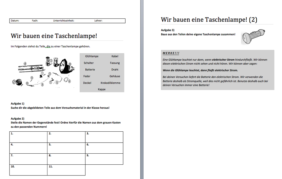
In order to enhance the worksheet, I inserted a headings and box where helpful information such as date, subject, teaching unit and teacher need to be indicated. I also modified the task description, split it up and changed the syntax since I found the original tasks rather confusing. Next, I tried to make the worksheet better readable by changing the font and line spacing and inserted numbers for each task. Furthermore, I created boxes of contrasting colors instead of the hand-drawn box of the original. The same was applied to the memory aid or information box ("Merke!") where I used bold font to highlight the most important information.
Considering the overall composition too closely spaced, I decided to extend the document to two sheets that still may be printed as one (landscape layout) without impairing its legibility. The overall layout was improved by using contrasts, bigger and coherent spaces as well as different fonts to give the worksheet a cleaner and more modern look. I maintained the original graphics despite its poor quality. I tried to improve its image quality, however, the number of pixels were too low to increase the size of it. The boxes in task two replaced the lines and offer more space to label the parts of the torch.
Altogether, I would consider the new version of the worksheet to be more "student-friendly" and motivating, i.e. the structure, layout tasks are clearer and the legibility is much better in comparison with the original version. Highlighting the most important information, the worksheet has become more intuitive and comprehensible.
